I will not claim to be an expert at real wing anatomy by any means, but here’s a quick lil tutorial on how I draw wings.
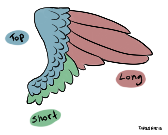
Most wings can be divided into sections, which helps when drawing them. I call these sections of feathers the ultra-technical terms Top, Short, and Long. (I know there are real anatomical terms for these, folks…this is more of a shorthand to stylize type of deal.)
Sometimes people draw the Short feathers section going all the way up over the tops of the Long section, but there are generally always Top, Short, and Long sections even in stylized wing art.
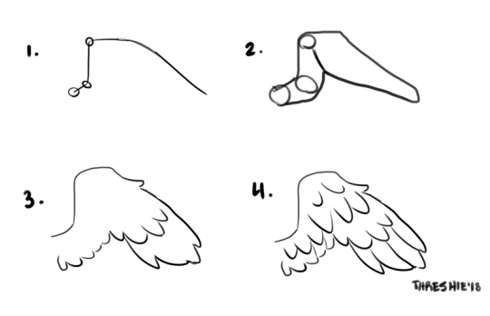
Once you have a process for drawing wings down, you can just sketch them out, but when you’re just learning it helps a lot to think about what the shape is under the feathers. Here’s a good process to try:
Draw a stick figure wing with circles where the joints are.
Pretend it’s a bald wing (spicy chicken wing?) and draw the shape you think the fleshy parts are under feathers.
Draw the basic outline of the wing. It’s good to think of where the edges of the Top, Short, and Long sections are as you draw the outline.
Add more feather details, keeping them short except for in the Long section.
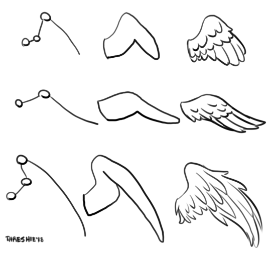
You can apply this same kind of process to wings with different numbers of joints, chibi wings, bigger more elaborate wings…
Tips & Suggestions:
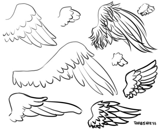
Try making the feathers pointy or round on the ends.
Draw the feathers going from the top edge downward. All of the tips point down unless you’re drawing wings that are really fluffy on top.
Remember the feathers overlap – draw the edges of the Top section first. so the Short and Long look like they are coming from underneath the Top.
Knowing how to separate the wing into sections will help you draw wings from different angles and in different poses, too.
Curving lines will make feathers look soft, and very straight lines will make them look stiff. Both can be interesting looks for wings, especially sharp or armored wings!
Reference pictures are the right way to learn to draw something! I encourage you to type “wings” into Google Images and look at not just photos of real wings, but how many other artists have stylized wings in their art.
Since you are stylizing, don’t stress about being perfectly anatomically correct. Of course there’s nothing WRONG with drawing accurate-to-life wings, but it’s not a requirement.
Mess around with proportions – make the Long feathers reaaaally long, or make the Top feathers fluffy and the rest smooth, etc. Have fun with it!
Here’s a mini tutorial on something that the Supernatural fan artist might find handy: how to whip up a nice plaid flannel pattern fast!
Drawing “Lazy Plaid” step by step:
1. Background color.
2. Make a NEW layer and pick your stripe color. Draw all lines going in one direction (vertical or horizontal.)
3. Change layer opacity to 50%.
4. Make another NEW layer, and draw all lines going the other way.
5. Change that layer’s opacity to 50%.
6. Repeat steps 2-5 with a second color, using the first stripes as a guide (always draw to the left of the other stripes on vertical layer, beneath other stripes on horizontal layer, for example. That’s what I did here.)
And that’s it! Chibi Sam is modeling the color I drew in the steps.
Tips and Suggestions:
Try to make the negative space between the lines near the criss-crossing parts turn out square.
You need to have the same size lines going each direction for it to look like plaid.
Play with colors! Flannel/plaid cannot be too bright and colorful, but it’s good to stick to 3-4 colors, tops. Remember that crossing colors will blend – Sam’s shirt has purple in it because I criss-crossed blue and red!
ALWAYS start a new layer for each stripe direction and color, or the reduced opacity will not make your cute lil plaid squares pattern where the lines criss-cross.
Tinker with opacity – I like somewhere between 50 and 75 percent.
Try making one color set of lines thick and the other thin.
Curving your plaid lines around shirt wrinkles and stuff sells it that the pattern is on the shirt and moving with it.
This can be used to make more of a basic checked pattern by drawing only one set of very thick lines.
I noticed the pockets of flannel shirts tend to have the pattern diagonal, which it’s not on the rest of the shirt. Good to know for realism!
Have fun, deck your hunter characters out in bright flannels, and by all means, link me if you use my tutorial. I wanna see your art! ♥
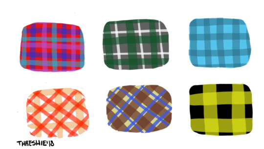
I’ll leave you with a few more plaid patterns to contemplate: